


With the majority of setup tasks falling on our internal team, addressing friction points during the onboarding process became a top priority.
Collaboration with various areas of the business, including customer success led to rich insights into some of the biggest friction points.


Setting up modifiers is a key part of setting up a menu, yet the current user experience was tedious, requiring multiple steps and jumping between pages.
Modifier groups weren't linked across items so if you wanted to make bulk edits like reordering modifiers, you would need to do it on every item. With the company's rapid growth before I joined meant they optimised for speed, leading to an accumulation of legacy code and complex logic.

Highlighting linked menu items made it much easier for new and existing users to see a modifier group in context when proof checking and making bulk edits.

Incorporating modifiers into item settings made it much easier manage in context, instead of jumping to another page.
We were also able to incorporate the re-order pattern across the entire menu which was another highly requested update.

Working closely with engineers and designers, I led the creation of our design system which enabled us to design and build more efficiently, creating cohesion across all our products.
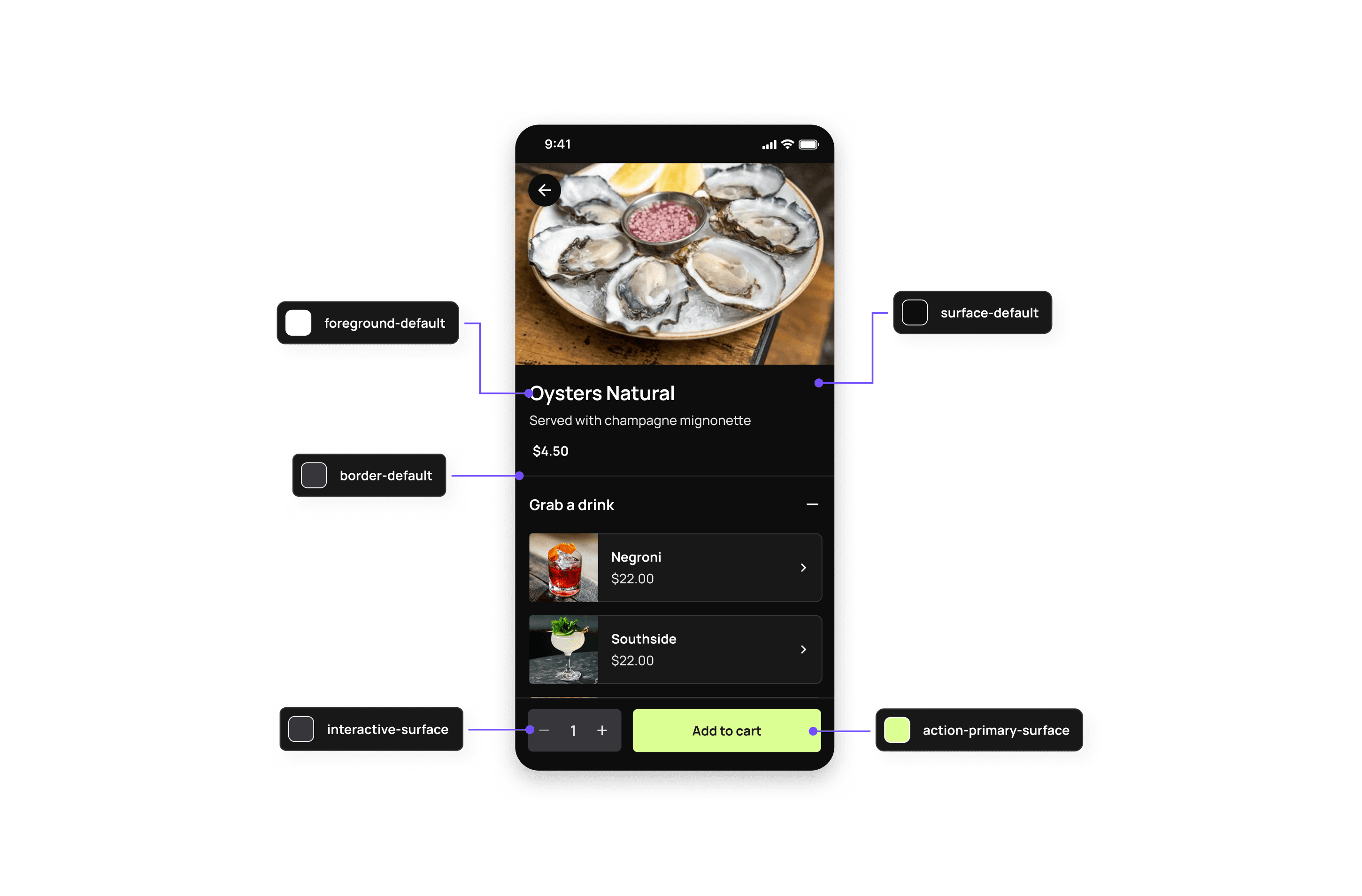
Introducing the flexibility to switch between light and dark mode allowed for greater accessibility, particularly in restaurants with dim or bright lighting.


Given the brand's playful nature, we prioritised accessibility in how we incorporated it into our interface elements. Including ensuring our icons and typography were easy to interpret.
Rebrand done by RE ↗
