Working closely with engineers and designers, I led the creation of our design system which enabled us to design and build more efficiently, creating cohesion across our products.
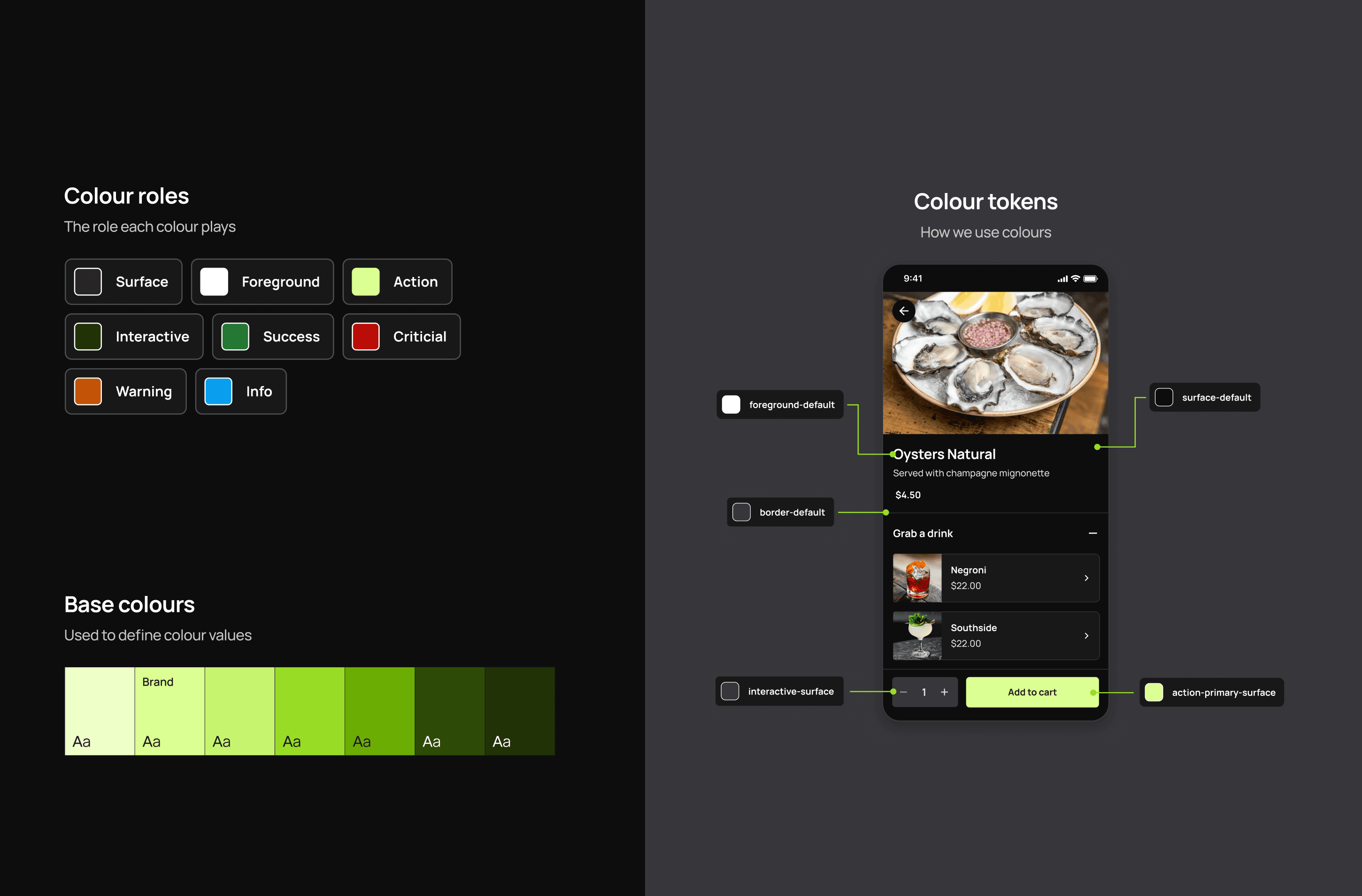
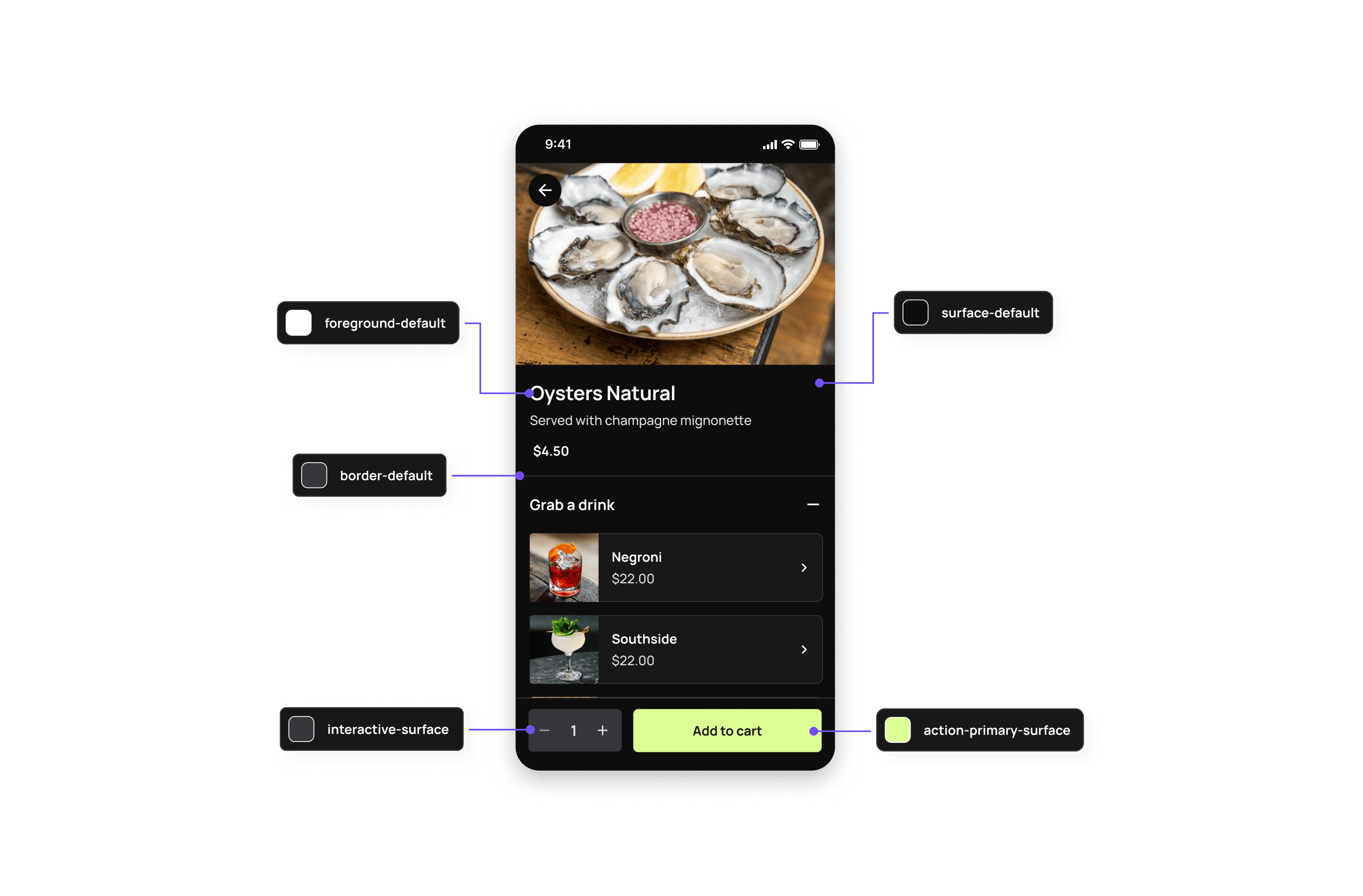
This included refining our visual style, defining foundational style tokens for light and dark mode and building out our core components in a way that could be easily used by our team.
Mr Yum worked with an external agency on their rebrand, making this a great opportunity to explore visual application.
Rebrand done by RE ↗

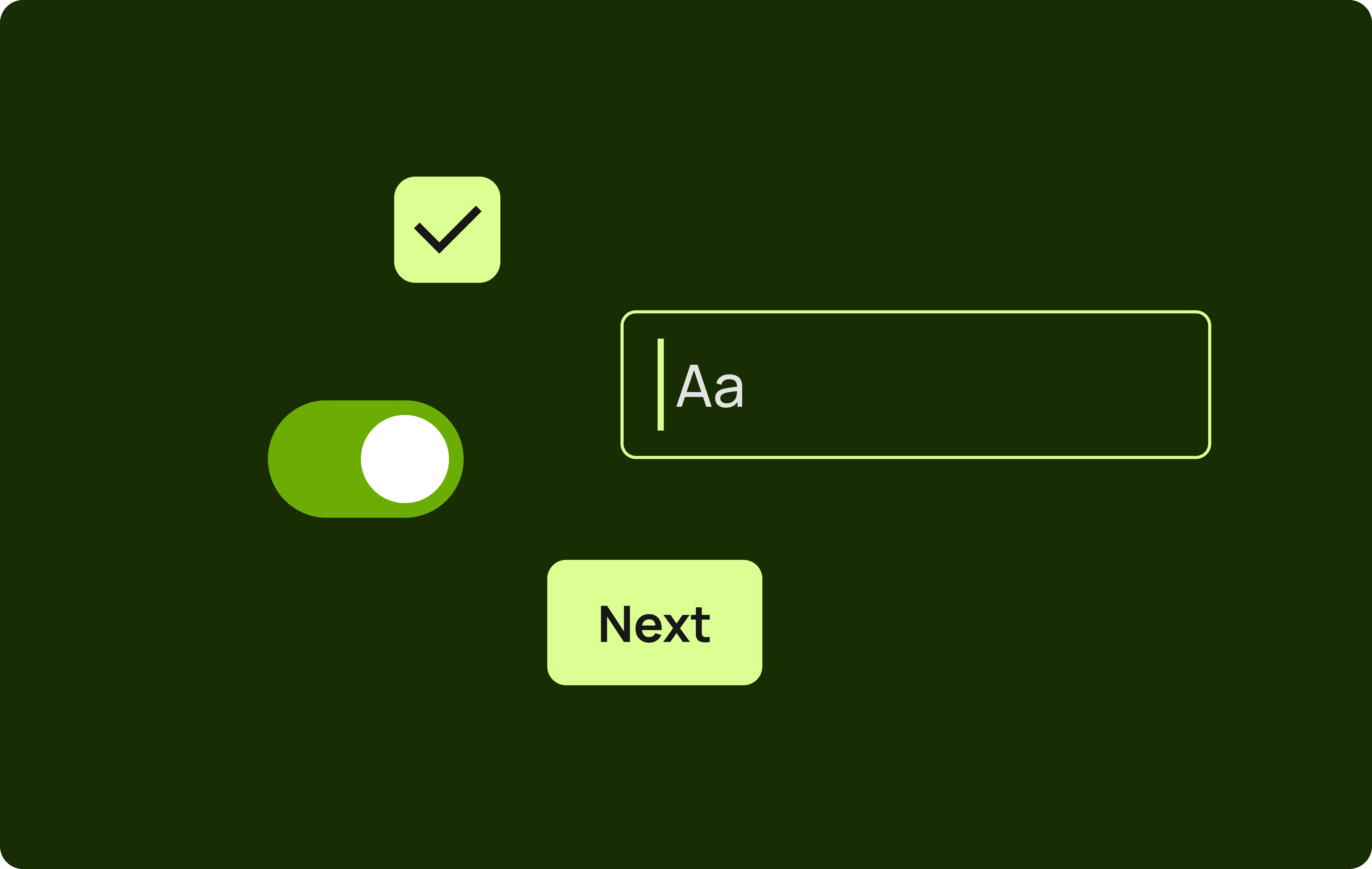
Given the brand's playful nature, we prioritised accessibility in how we incorporated it into our interface elements. Including ensuring our icons and typography were easy to interpret.

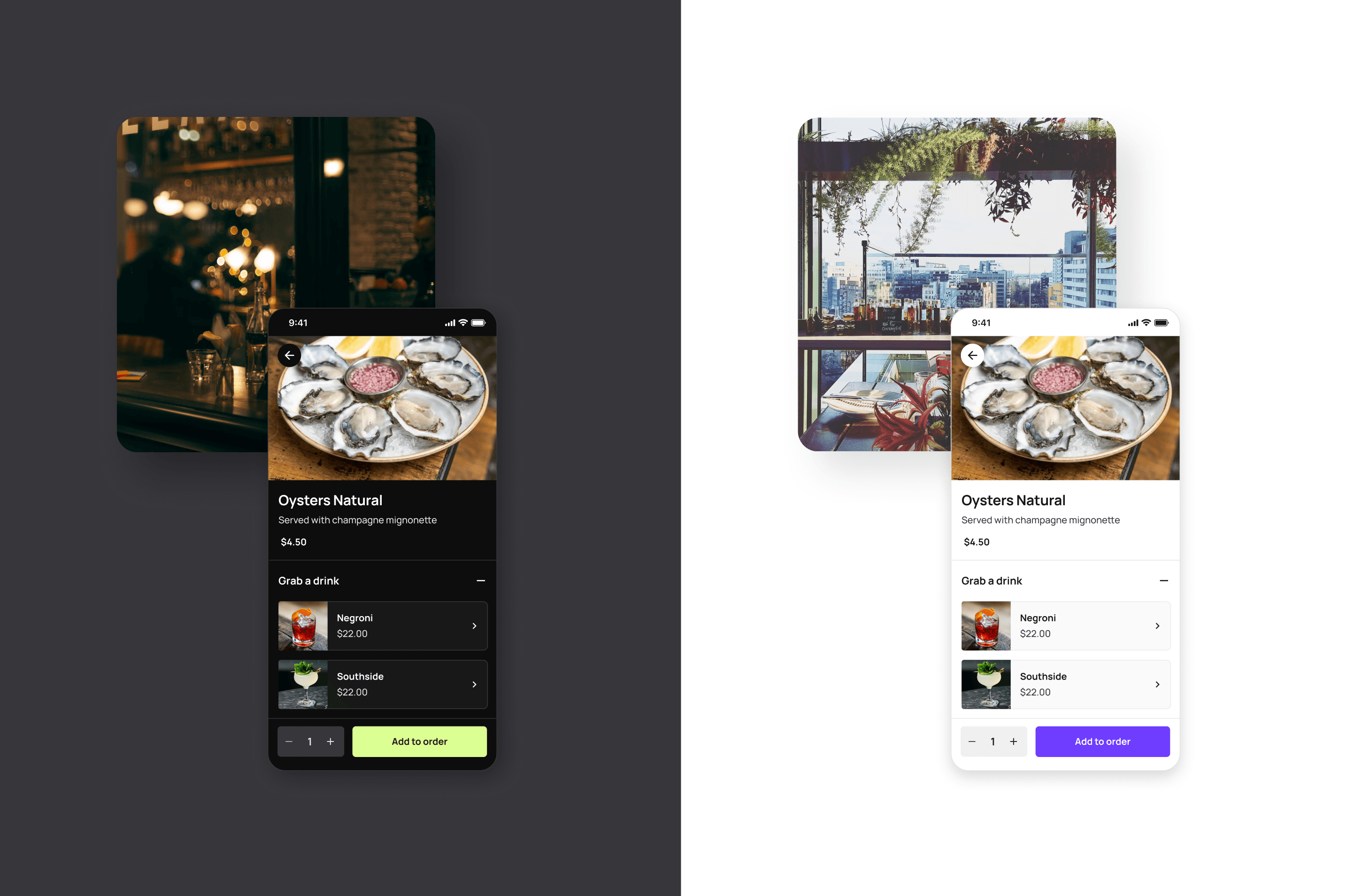
Introducing the flexibility to switch between light and dark mode allowed for greater accessibility, particularly in restaurants with dim or bright lighting.
Defining colour roles helped establish consistency across our products.