At Front, the inbox has always been where teams go to work. But over time, the very surface designed to keep teams focused was making that focus harder. As Front shifted toward customer support, the patterns that once worked no longer scaled.
With AI features on the horizon, we also needed a cleaner foundation — one that could support what was coming without inheriting the complexity that had built up.
I worked closely with two other product designers and our head of design — one designer focused on the design system, the other on the conversation view.
The goal was to redesign the inbox to restore focus, scale with Front's shift to customer support, and lay a clean foundation for AI.
Front had also undergone a rebrand and it was key the product reflected the new direction.
Previous experience
Redesigned experience
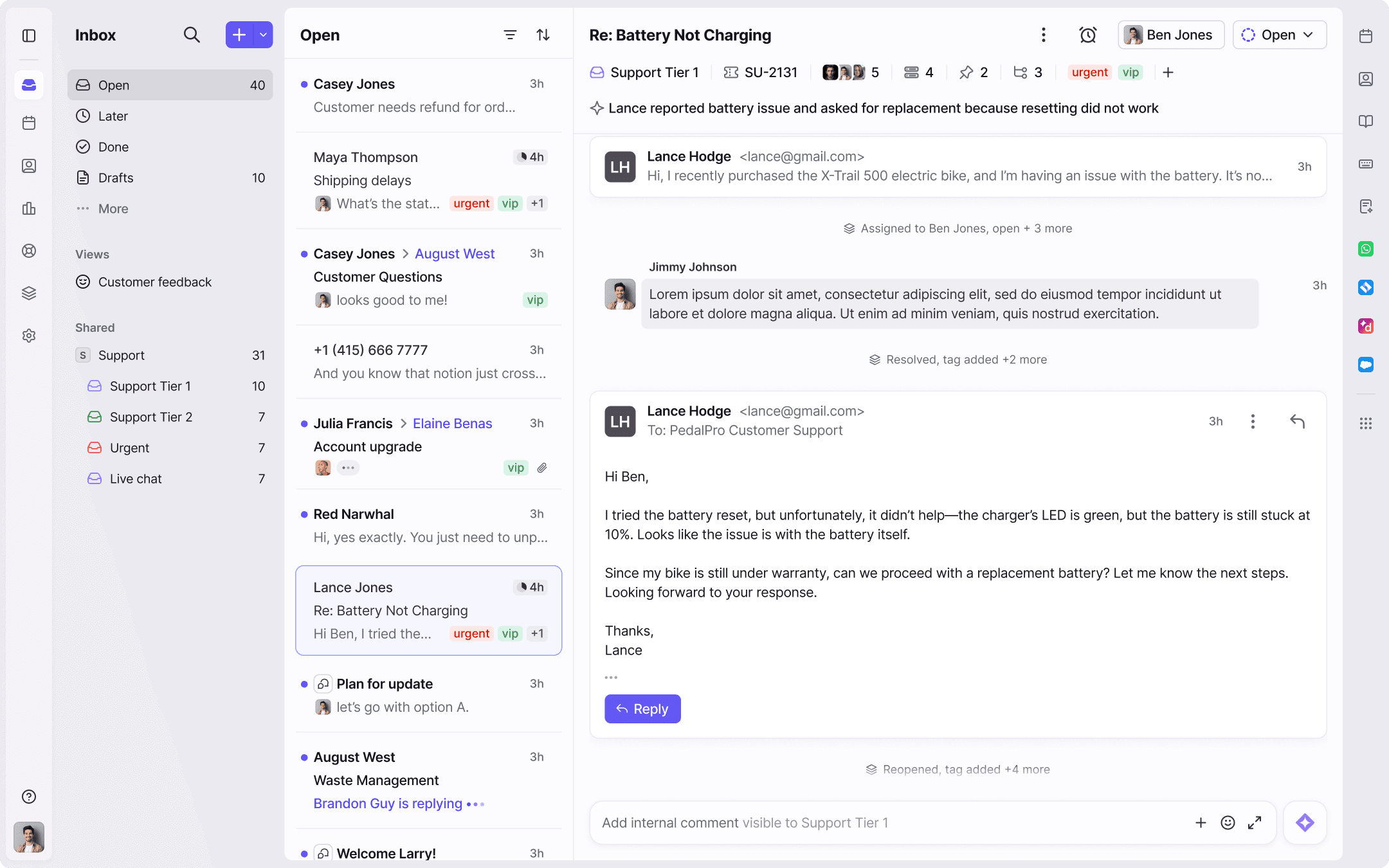

We introduced a new top-level tab system: Open, Later, Done that better reflects how people actually triage work
As ticketing evolved, our old navigation couldn't keep up. Statuses no longer reflected the conversations they included and things were getting lost.
We explored a new way of working through the inbox early, running sessions with customers and internal support teams to find where it broke — and where it could open up new ways of working.

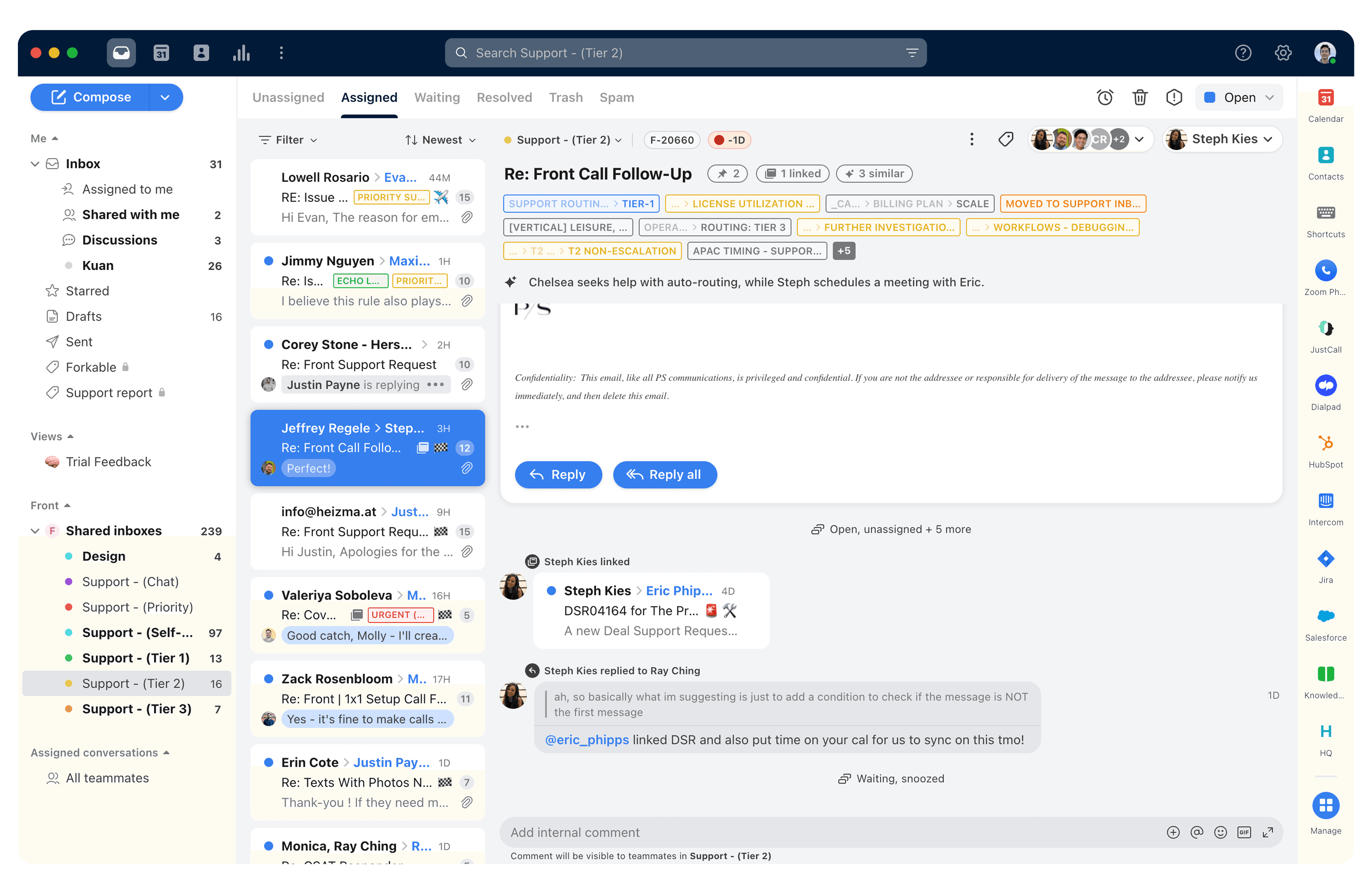
Early iterations
We learned how differently roles and teams use their inbox, so we baked in flexibility - letting you highlight the folders that matter most to you.
We learned customers were losing track of where they'd been mentioned — a key gap we made sure to address in the new approach.
Only a small segment of customers used discussions, so we initially made it less prominent and bundled it under subscribed. We quickly learned that didn't work for the customers who relied on it.
We launched an internal beta and ran all feedback through the inbox. Using Topics, we could identify the top themes in real time as they came in.

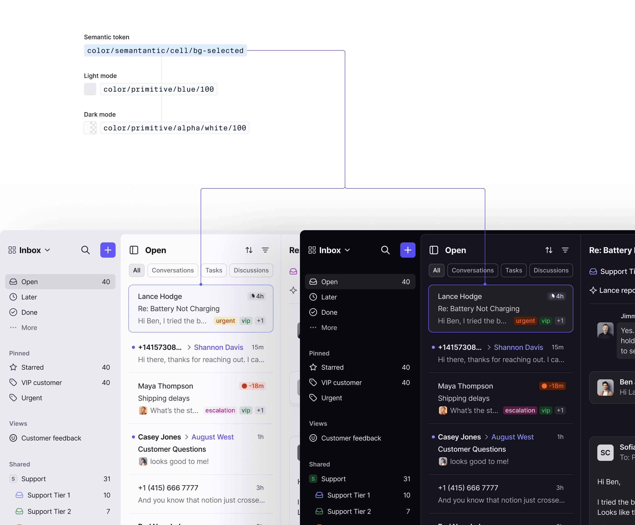
A flexible content system optimized for scanning and channel context.
By reducing tag overload, refining content lockups, reorganizing metadata, and introducing variable heights to highlight what was most crucial per channel.

Early iterations (first image is the previous experience)